A Landing Page is a Web page created with the goal of converting site visitors into leads (contacts), i.e., actual Customers
Let’s start with the general concept: Landing page means “landing page.” In recent times, it has become a very powerful communication tool. In fact, even though it is a landing page, it is very different from all other “normal” pages on a Site.
Its goal is to create contacts and turn users into Customers .
Two avenues can be used to do this: lead the User to fill out a contact or inquiry form (so that he or she can be contacted at a later time) or, if e-commerce is involved, induce him or her to buy directly.
Each Landing Page must be built with the purpose of acquiring leads.
To create an effective landing page, it is important to pay attention to the design and content that will make it up: it must be very targeted, clear and direct to lead to CONVERSION.
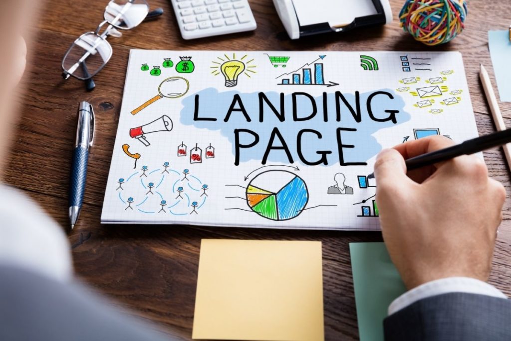
Here are the features to pay close attention to when creating an effective Landing Page
1. Title
The title should be catchy and effective: highly visible, with a clear and direct message that will intrigue the User and make them want to continue reading. Remember that it is the first element that will catch the reader’s attention .
2. Subtitle
Also called sales text, it is placed immediately below the title. It must be brief but able to effectively communicate what you propose/sell, the main features, benefits, and how your offering can solve a specific Users problem.
3. Call-To-Action
Every self-respecting Landing contains at least one Call-To-Action, that is, an action for Users to take. That’s what it’s all about, getting people to take action toward your service/product.
CTA is essential to create conversion. Remember that it should be very visible, perhaps in a different color from the rest of the content, so that it is immediately recognizable. One tip: put it in the form of a button-people will be more likely to click on it!
4. Content
You need to be able to explain your offer in an engaging way, with simple but direct language that can make it clear that you are doing it professionally and not improvisationally. Do not dwell too much on unnecessary text, otherwise you risk boring and discouraging Users. Do not use overly specific technical terms. You have to know how to talk to everyone.
5. Design and Navigation
The design should be simple and not distract the User, but direct the eye to your offer (Call-To-Action) .
The page should be well constructed, all content should be neat and easy to use, and the call-to-action easy to locate.
When studying the design of your landing, study colors carefully because they affect people’s psychology .
6. Media
Photos and videos help the reading. They make content less boring and allow for easier understanding of concepts. Use high-quality photos and videos so as not to risk looking unprofessional. Your offer must be advertised in the best possible way! Remember, images and videos are the first step in capturing the customer’s attention
7. Social Links
Social media buttons are essential. First, because they allow direct sharing, thus more (free) visibility to your Landing and will help you attract traffic. Second, because through Social you can create your Community and promote your updates.
8. Testimonials
People trust what others say. If you offer testimonials from people who have already tried and purchased your service/product, many more people will be prompted to trust you .
The Landing Page is critical for the vast majority (if not all) of companies that want to leverage the Web to increase their business
To do this effectively, it is essential to create a perfect Landing Page and then leverage the concept of Conversion, which enables the achievement of the intended goal: generation of a contact (lead generation) or directly as a sale (macro-conversion).
REQUEST A FREE QUOTE FROM 00UP
